Does your YouTube Channel have a Brand Identity of its own that speaks for it even before you do? Do you believe in increasing your click-through rates through a solid brand identity for your YouTube Channel?
This is part 2 in the series with TinaTimeTV where I look into her YouTube channel and give her tips on how to get more out of it. In the last part, we discussed how a few simple channel makeover tips can bring a drastic change in the look and feel of a channel.
Part 1: How to Makeover your YouTube Channel to Get More Views
You can watch this session on my YouTube channel as well.
Improving Click-Through Rates Through Visual Brand Identity
In this post, I am going to look into Tina’s videos and tell you guys a few things about a YouTube Channel’s brand identity and how working on that can increase your click-through rate.
What is your channel’s brand identity? It is the look and feel of your channel that stays in the minds of your audience and speaks for you even before you do.
Tina left her channel as she went on vacation, and her audience did not hear from her for a long time. Now that she is back, things seem to be picking up on her channel even if the pace is slow and that’s great. I’m glad that Tina didn’t give up, get mad or walk away. Some people are impatient, you know.
My main channel’s been around a long time, but I know that doesn’t mean that I should expect anything when I’ve taken a break or when I’ve changed my content a little bit. It could take months and months for the YouTube Algorithm to understand what I’m doing and understand how to serve the market.
Moreover, it takes a while to get my subscribers to trust me again. They’ve got to trust you to make consistent content. It’s good to take responsibility for that to keep going. I’m glad that things have started to pick up for Tina again. That’s something you only get when you are consistent.
Get Consistent Thumbnails
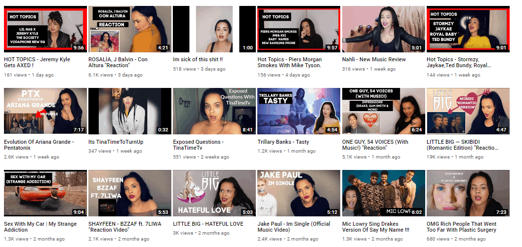
One thing I would suggest to Tina and everyone out there is to perhaps have more of a consistent look for your thumbnails. In Tina’s channel, I saw different fonts, different sizes, different colors, which is fine, but your audience doesn’t really get your brand this way.
In Tina’s channel, I didn’t get the look. I did see like there’s some common vignetting but some fonts are pretty hard to read and a few need change in color to pop out and be more visible.

Have Some Brand Colors
It’s good to have some brand colors that speak in your visuals. You can choose some brand colors even if you don’t want to go for a full brand deal. It doesn’t always have to be the same, but it’s really good for viewers because when they see a thumbnail, eventually, they’re gonna know this is a TinaTimeTV video before they even read what it says. They start to get used to the color, the look, and the feel of your videos.
On my music channel, my colors are blue, yellow, and white. My Dare to Dream School Is for a bit of a more adult audience, but still slightly young and feminine too, so I went for purple, blue and white. Those are my colors.
Anyways, the idea is that the thumbnails don’t always have to be identical. You can change it up to change the look of your channel. I suggested to Tina that it doesn’t always have to be her on the right and the box on the left. You can make many variations but still have a similar look, similar colors, and similar fonts.
Reflect your Brand and Content
Since Tina makes reaction videos having a more emotive face on the thumbnails can perform well for her. I saw that in a few of her thumbnails which reflect the content as well as her personality.
If you are doing something like Tina, that is making reaction videos, having an expression on your face in the thumbnail can make a difference. In most of her thumbnails nothing much is going on and that’s a chance to have more of a visual reaction from her audience.
To stand out you want to tease what’s going to happen in the video. Perhaps you didn’t like the music video or maybe you did, but you’re going to surprise people. You start out thinking you’re not liking it and weren’t going to like it but then you did. In Tina’s case, she should want something that really has a visual punch to it.
It depends on the channel though. If you are going for an elegant theme on how to organize your closet and that kind of thing, maybe you don’t need a big punchy, bold kind of look and color.
But for Tina, since she is doing reaction videos it’s totally acceptable to do something that stands out more and has more of a color splash. I suggested her to decide on her look and decide on some brand colors.
Hire Someone
You can hire somebody on Fiverr. I hired a person on Fiverr to do my overall look, banner and my graphics. But once in a while, I’ll also come to him for some thumbnail templates and I’ll ask for a few pieces that I can piece together in Photoshop. These should fit that same look, the same theme, and the exact same colors.
I even save the hex code (the numerical representation) of the colors to be precise. So I always know my colors wherever I am on my blog, on my website, or I’m making new graphics. This is to have a consistent look and feel all across the Internet.
Think about Exciting and Inviting Titles
In addition to thumbnails, you also want to really think about your title. Think really long and hard about it and work on your title before you even shoot the video. That will help you know whether this is a
video that will even be something that your audience will want. Once that will perform well for whatever performance metric you’re going for; might not be views in all cases, you’ll see the title actually really worked.
It’s up to you, think what do I want to accomplish with this video? What will I call it? And then once you have a really good idea of what the video will be about, what it will be called and what are the thumbnail will look like, then you can start working on actually making the video.
Have A Direction
It’s important to work in a direction. Most people just shoot the video and think about the rest later. And if you’re not result-oriented, it will affect how you shoot.
It’ll affect what kind of thumbnail pictures you take and it will affect your working on the title.
You might decide, oh, you know what, this is old.
Nobody cares about this anymore.
Or Oh, this would be better if I went for this angle.
What if I made it a British person reacts to all American Hero, GI Joe movie number five?
Having a solid direction helps you think of the angle and that way you can think of the better title.
What Actually Happens
The reason why I bring up titles is that the title and the thumbnail are absolutely the most important things to consider when we’re talking about trying to get your existing subscribers to watch your videos. Because here’s what’s happening.
You are not getting 111,000 people deciding not to watch your videos.
A lot of those people don’t even know you have a new video out because nowadays people are subscribed to so many channels that YouTube isn’t going to show them everybody on their subscription feed.
In fact, now YouTube is so obsessed with improving overall watch time that they will show people videos of channels that they are not even subscribed to. So now you’re competing with people that your audience doesn’t even know.
For that reason, it is so important that your title and your thumbnails stand out and are representative of the content that you think they will like. What probably is happening is that YouTube will show your brand new video to just a small percentage of your YouTube subscribers. And if it’s not a really compelling thumbnail, if it’s not a title that stands out, or like in Tina’s case, if it just says Tina reacts to ‘name of a movie that the subscriber hasn’t heard of’, then maybe the subscriber doesn’t care. They don’t know what that movie is and so they just don’t click it.
It’s important you think about that title. Maybe it’s a movie that they’re going to want to know about because your title is really funny or it’s terrible but in a good way. If that’s the case, then it needs to be something like: Tina reacts to the worst movie of 2019.
That way it doesn’t matter if they know what the movie is. All that matters is, oh, they want to know what the worst movie of 2019 is. They might now be more likely to click on it and then YouTube starts
paying attention to you as well.
YouTube is thinking when I showed this thumbnail and this title to this subscriber, did they click it?
Nope, they didn’t. They kept scrolling.
Then maybe this video is not that good.
Over time it will show it to fewer and fewer subscribers because it needs that click-through rate as
well as other indicators that we discussed to determine if this is a good video fit for that person.
You should be focusing on how to get your subscribers to click on the video more when the video first comes out because then it will compound and YouTube will show it to more and more people from your subscribers until there’s a general drop off. This is the same concept as Instagram’s. The algorithms has to be figure it out.
YouTube Channel Brand Identity in Conclusion
So, in conclusion, you need to be doing a few things to make people recognize you as a brand:
- You need to work on your colors, font type, font sizes, and general styling to gain a brand identity.
- Make compelling thumbnails that speak of you, your brand and the content inside the video. Thumbnails should be made with the focus on inviting people to your content.
- Same goes for the titles. Titles should be as catching as the thumbnails so that it helps to increase your click-through rates.
Stay tuned for part 3 of this series and more amazing tips on expanding and improving your YouTube channel.
Pin It


Michelle Osorio is a singer, filmmaker and content creator turned entrepreneur sharing her secrets to growth on social media and livestream.

